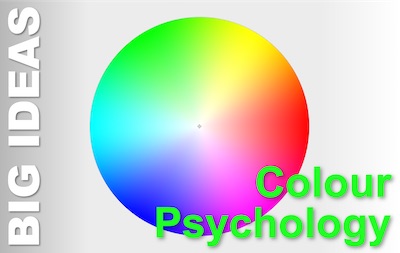
 We associate colours with brands and brands with colours. Some colours and combinations immediately evoke a brand. And others instantly trigger a feeling. This is the role of colour psychology in marketing.
Much of what people think they know about colour psychology is little more than pseudo-science. Chromatic astrology, if you will. But there is also a growing body of research evidence to fall back on.
And what that underlines is that, for whatever reason, there is some firm basis for colour psychology.
Why Does Colour Psychology Work?
There are a number of theories for the origins of the associations we have between different colours and meanings. Broadly, there are three types:
- Evolutionary Programming
Over evolutionary time, certain colour associations have become embedded in our psychology at a genetic level. We are born with them.- Warm bright sun = good feelings and cool dark night = low arousal
- Bright red berries = important food and brown sticks and rocks = rugged tools
- Schema and Cultural Links
Societies set colour/meaning rule sets that we incorporate into our interpretation of the world as we grow up.- Western cultures: red = danger, Far Eastern cultures: red = good fortune
- Western cultures: pink = girlish, blue = boyish
- Conditioned Associations
As we go through our lives, events, emotions and colours coincide, reinforcing linkages in our brains between stimulus and response. If we saw a big yellow sign just before a traumatic event, yellow might thereafter induce feelings of dread. But, if we saw the same sign on a first date that led to a long and happy romance, yellow might induce feelings of contentment, passion, or joy.
All of these are just hypotheses. They each have the benefit of logical plausibility and an amount of supporting evidence. The likelihood is that all hold some truth, but that reality is a messy mix of all three and maybe other factors too.
For this reason, there is no absolutely predictable colour-response formula. We are all the sum of many influences.
The extent to which colour psychology ‘works’ is that there are some patterns that match the reality for a large number of people – no doubt due to some measure of shared evolutionary history, cultural immersion, and lived experience.
What is Colour Psychology?
Colour psychology is the study of how different colours and colour combinations affect our unconscious and emotional responses to things and situations that are associated with those colours. But when we think of colour, we need to be aware of:
- Hue
The actual colour: red, blue, green, yellow, etc
Those four are, by the way, the major colours in colour psychology. The secondaries are pink, orange, teal, purple, brown - Saturation (or Chroma)
The intensity of the colour
De-saturated (pastel) and intense (strong) colours have different impacts. And these impacts are often more reliable than those of the hues.
Black and white are completely de-saturated with no chroma or colour in them - Luminosity (or Value)
How bright the colour is. If you add white to a pure colour, it gets brighter. The variations are often called ‘tints’. If you add black, the luminosity goes down. These variations are called shades.
In colour psychology, high saturation (intense colour) usually has the same impact on our responses as low luminosity (dark colour). - Colour Combinations
This is more complex, but designers often mix colours in one of four basic colour schemes:- Monochromatic – all the colours have the same hue, but different saturation and luminosity
- Analogous – all the colours have similar hues (and often matching saturation and luminosity)
- Complementary – the colours come from opposite positions on the colour wheel, giving maximum contrast (many of our Big Ideas title images use complementary colour schemes for maximum visual impact)
- Triadic – three colours that are equally spaced on the colour wheel create harmonious combinations.
What do Different Colours Mean?
You’ll find a thousand articles and infographics with colour psychology that assign meanings to colours. Your best bet is to treat all of these with caution. In choosing colours, think about the associations you want to convey. Then see which colours convey them. Now look for the colour or colours that come up most. This table is illustrative of the many and draws on the work of Nick Kolenda*. It is not wrong, but I have deliberately limited the content, to compel you to research further.
- Red – energy, arousal, excitement, action
- Yellow – excitement, emotion, attention, pleasure
- Green – relaxation, nature, utility, likeability
- Blue – authority, logic, quality, relaxation
- Black – weighty, competent, utilitarian, elegant
- White – calming, simple, pure, sophisticated
How to Read Colour Psychology
Start to notice brand colours and corporate logos. What mood do the colours convey?
Here’s the question that keeps me puzzling. I’ll take orange as an example. It’s often thought to convey creativity and warmth.
But now, after many years of sophisticated branding, do companies choose orange because of those associations? Or, do we read orange that way because of the associations with the companies that already use orange in their branding?
Chickens and eggs come to my mind!
What is Your experience of Colour Psychology?
We’d love to hear your experiences, ideas, and questions. Please leave them in the comments below.
* To learn more…
One person is better at anyone else at distilling a mass of academic research into easy-to-understand and helpful to apply marketing information. And that is Nick Kolenda. If you want to know more about this topic, skip right to his massive article, ‘Color Psychology’. Everything else I found on the web is either flaky in comparison, or (like this article) inspired by his article. Some, more blatantly than others. If you sign-up for Kolenda’s (excellent) newsletter, you’ll access loads of resources, including his colour psychology table which is the best I have seen anywhere.
